The right colour cannot make a tight sleeve comfortable, and a well-cut jacket can still be a colour you rarely reach for. Combining body shape and colour analysis works best when you keep those observations separate long enough to understand each one. Start with clothes that fit, compare colours under reasonably consistent conditions, then bring the results together in outfits you can wear on an ordinary day.
Separate the silhouette decision from the colour decision
Choose a familiar outfit as a starting point: trousers that stay comfortable when seated, a top that lets you reach forward and shoes you actually walk in. Look first at the shape of the clothes. Decide whether you enjoy the amount of waist definition, the length of the top and the relationship between the trouser leg and shoe. These are silhouette preferences. They do not tell you whether the top's beige is too warm, too pale or simply uninteresting to you.
Next focus on the colour near your face. Does the colour seem pleasing in this light? Do you prefer a stronger contrast between your hair and collar, or a quieter transition? Those are visual judgments rather than measurements of your worth or health. Seasonal palettes can offer a useful vocabulary, but their boundaries and interpretations vary. A palette name should help you describe colours, not turn every purchase into a compliance test.
Write two separate notes. For example: “I like this straight leg with a shorter top” and “I prefer the muted blue to the bright coral.” Keeping those statements apart prevents a common mistake: rejecting a colour because it appeared in an uncomfortable garment, or rejecting a silhouette because you disliked the fabric's shade. You can combine the observations once each has a fair test.
Compare colours without changing the entire outfit
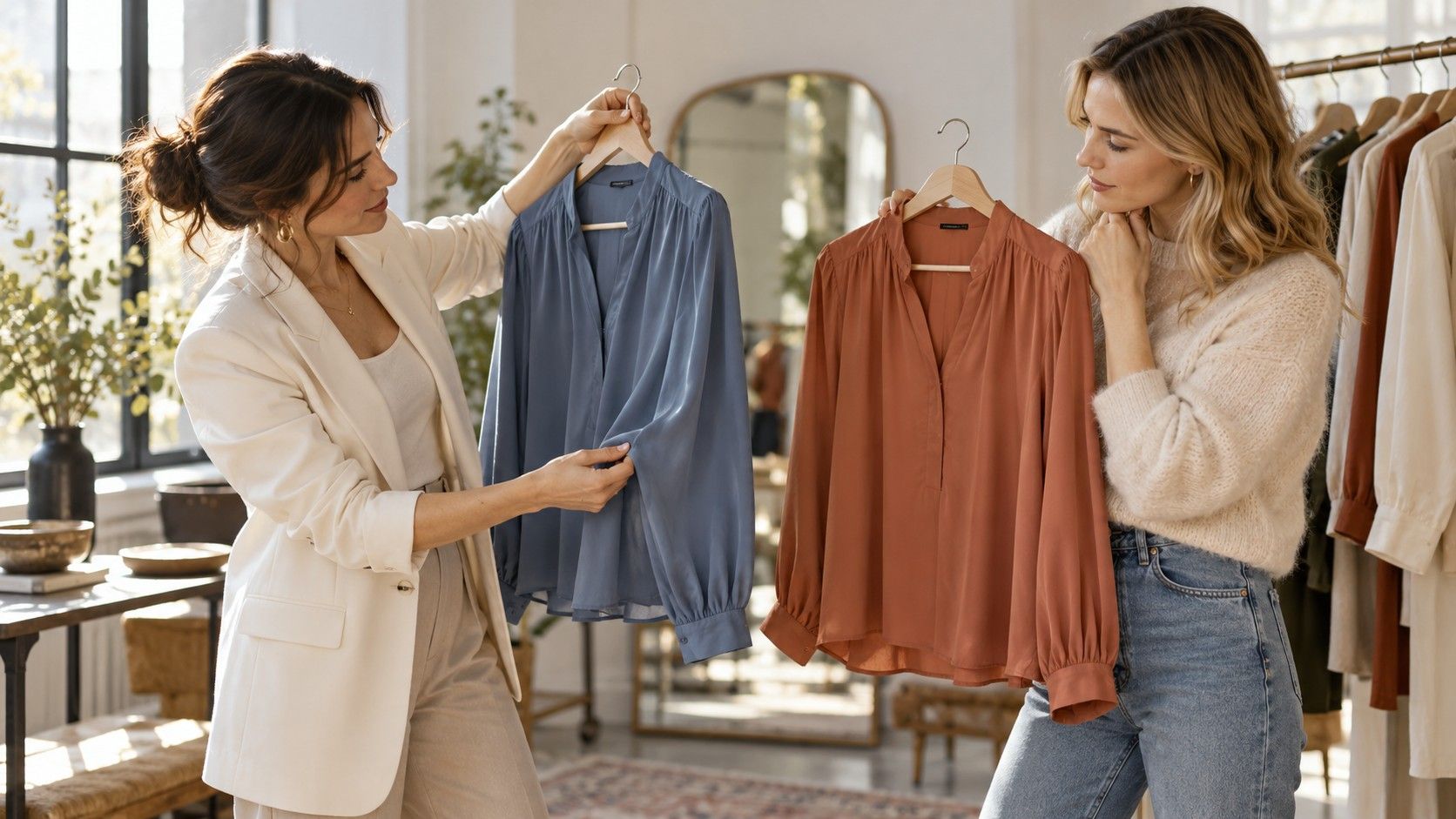
Use two scarves, fabric pieces or tops with similar necklines to compare colour families. If possible, keep the background, lighting, hairstyle and position the same. Soft daylight away from direct sun is a practical starting point. A room with a strongly coloured wall or a warm lamp can shift your impression. Do not compare one option by a window in the morning and the other under a bathroom light at night.
Try a close comparison before a dramatic one. Muted teal and clear turquoise, or soft rose and brighter pink, may reveal your preferences more clearly than navy against neon yellow. Look for what you enjoy about the whole face-and-colour relationship rather than hunting for defects. If both work, keep both. If the result is uncertain, “undecided in this light” is a legitimate note.
Phone photos can serve as reminders but add another variable. Automatic white balance and exposure may change between shots, especially when a large area of bright fabric enters the frame. Avoid making a precise undertone claim from a single picture. Check the fabrics directly again before spending money, and remember that texture and sheen can alter how the same nominal colour appears.
Control fit before judging a palette
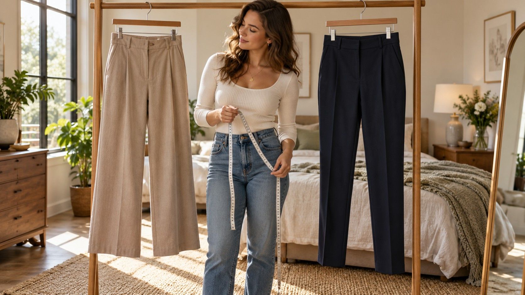
A blouse that strains at the bust creates folds and shadows which can distract from the colour comparison. A neckline that sits unevenly may make the whole garment feel awkward. Start with enough room to breathe and move, then check the shoulder and armhole. In a woven shirt, reach forward and raise your arms gently; you should not have to hold yourself still to preserve the intended look.
Fabric drape also matters. A charcoal satin blouse reflects light differently from charcoal cotton jersey. A pale linen jacket may look more textured and casual than a smooth pale blazer, even when their colours are close. If one version feels wrong, ask whether you dislike its stiffness, shine or bulk before deciding that the colour is unsuitable.
Body-shape language can prompt useful checks, such as whether a straight jacket has enough space over the hips or whether a shaped waistband follows comfortably. It cannot select the best construction for every person with the same label. Compare the garment against your own proportions and movement. Where fit is the problem, another cut or a simple alteration may be more useful than a different palette.
Place contrast where you want the outfit to change
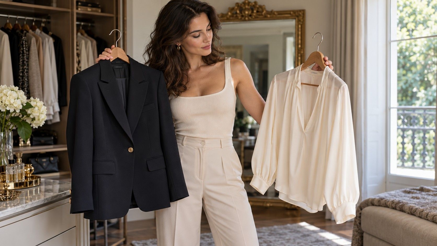
Colour placement changes where an outfit appears to divide. A light top with dark trousers creates a visible break at the hem or waistband. A top and trousers in similar depth may read as a more continuous line. Neither effect is inherently better. The useful question is whether you like that division at that position with these particular clothes.
Try a tucked and untucked version of the same top. Then add an open layer in a similar colour to the trousers. You have three different arrangements without changing your body or buying a new wardrobe. Check them in a full-length mirror with your usual shoes. A long cardigan that looks pleasing from the front may catch on the trouser fabric when you walk, so include movement in the comparison.
There is no obligation to use dark colours to hide an area or light colours to enlarge another. You may enjoy a bright skirt because it makes the skirt the focus. You may choose a low-contrast outfit because it is easy to combine. Treat claims about visual balance as descriptions of possible effects, then decide whether you want the effect. Your hips, shoulders and waist do not need to be made equal.
Accessories let you adjust a colour relationship with little commitment. A scarf can bring a preferred shade near your face; shoes can repeat a colour lower in the outfit. Check practical details too: a scarf that slips all day or shoes that hurt are poor solutions, however neatly they connect the palette.
Build three combinations with different jobs
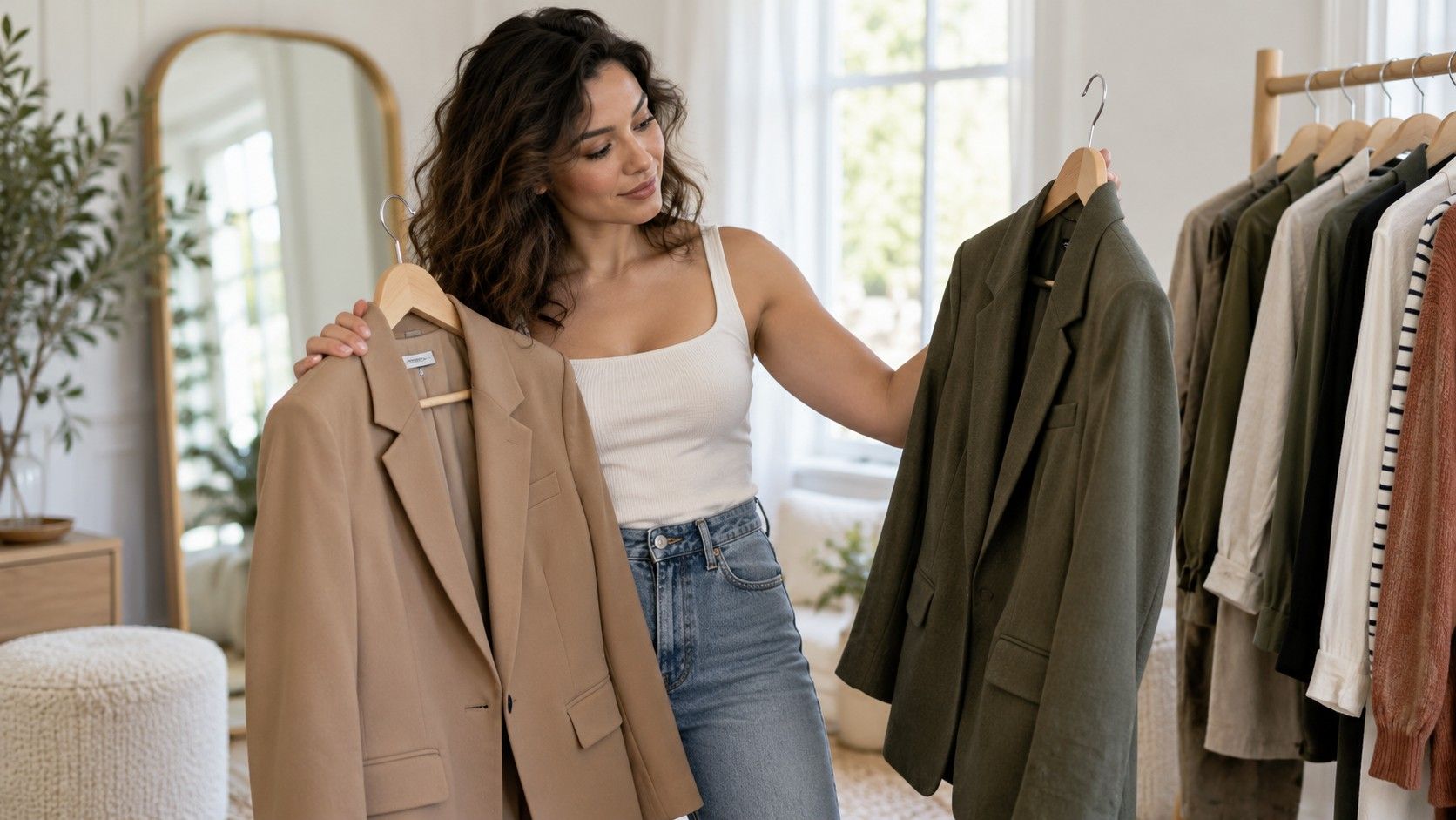
Start with a casual combination you already use. For example, keep comfortable straight trousers and a soft knit, then compare a muted blue knit with a warm neutral one of similar weight. Add a jacket only after choosing the version you prefer. This tells you whether the colour works in a familiar shape rather than asking you to judge five unfamiliar items at once.
For a smarter outfit, use the same trousers with a woven top and a layer that has enough upper-arm room. Test whether the top works tucked, partly tucked or loose. Choose the finish you like and can maintain while sitting and standing. If the jacket and trousers are similar in depth, a lighter blouse may give the amount of contrast you want without needing a separate rule about your body-shape category.
The third combination should solve a real gap, such as a warm-weather day, an evening meal or working from home. Change the fabric and formality to match the situation. A breathable shirt dress might suit summer, while a knit dress may suit a cooler setting. Try the full outfit with suitable underwear and shoes; colour coordination cannot compensate for a dress that catches at the hips or limits your stride.
Take a simple photo of each finished combination as a dressing reminder. Label it by use, such as “office with flats” or “warm weekend,” rather than by a string of style identities. The aim is to retrieve a workable outfit when you need it. An outfit that earns a place in your week provides better evidence than a theoretically perfect combination that remains on a hanger.
Keep the clothes that work even if the labels disagree
You may like a colour outside your tentative season or a shape outside a guide's recommended list. Try to identify why. Perhaps a slightly oversized shirt works because the fabric is fine and the sleeves roll neatly. Perhaps a vivid colour works because you enjoy its contrast with a quiet outfit. Specific observations help you repeat the result without needing to rewrite your identity.
For shopping, carry a small set of practical requirements: enough room in the upper arm, a comfortable waist, two preferred neutrals and several colours you enjoy together. Bring a familiar garment or a clear reference photo when comparing shades, while allowing for lighting differences. A colour name such as olive or cream covers a wide range, so inspect the actual fabric rather than trusting the label.
Before buying, make at least two combinations with clothes you own. Check care instructions, opacity in daylight and whether the fabric feels comfortable against your skin. If the new item needs a different bra, shoes and outer layer to become usable, include that cost and effort in the decision. Body shape and colour analysis are most useful when they reduce that friction and help you wear more of what you already like.