A dark, clear colour combination can look striking on a rail and surprisingly severe once every garment has a sharp edge. Combining Soft Natural and Deep Winter ideas gives you two separate things to test: how clothes move around your body, and how their colours look beside your face. Neither label is a scientific diagnosis, and you do not need to settle your identity before trying a better outfit.
Keep the two styling questions separate
Soft Natural is a label used within the Kibbe image framework. Deep Winter is a seasonal-colour label used in some colour-analysis systems, whose terminology and palette boundaries vary. An online combination of the two is a styling interpretation, not an official combined category. A shoulder measurement, body-shape calculator or full-length photograph cannot establish a colour season.
Start with a garment you already like wearing. Decide whether the issue is its fit, its colour or the way it combines with other pieces. A black blouse may look pleasing near your face but pull across the back; a comfortable blouse may be a colour you rarely reach for. These are different problems. Changing both at once makes it harder to understand which adjustment helped.
If you are unsure about either label, keep the experiment smaller. Try the same trousers with two necklines, or compare a dark shirt and a medium-toned shirt with the same cut. You are collecting preferences, not proving a type. Keep successful clothes even when their colour or outline does not appear in an inspiration board.
Test clear dark colours near the face in ordinary light
Deep Winter palettes are commonly presented as dark, relatively cool and clear, but those descriptions do not specify an exact universal set of shades. A navy top in one shop may be muted, almost black or slightly violet in another. Compare the fabric itself rather than relying on names such as midnight or winter berry. Store lighting and phone processing can make those differences harder to judge.
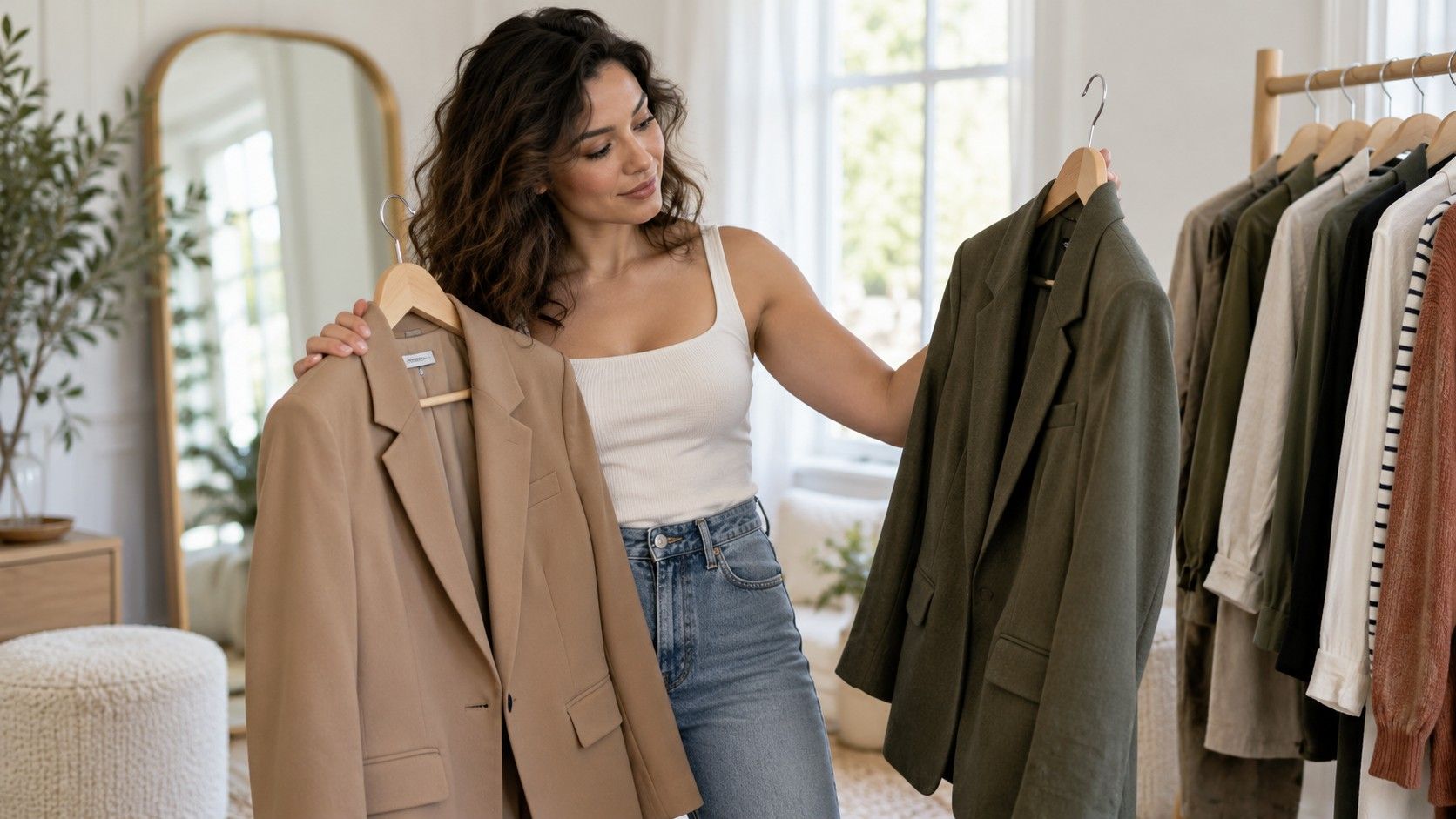
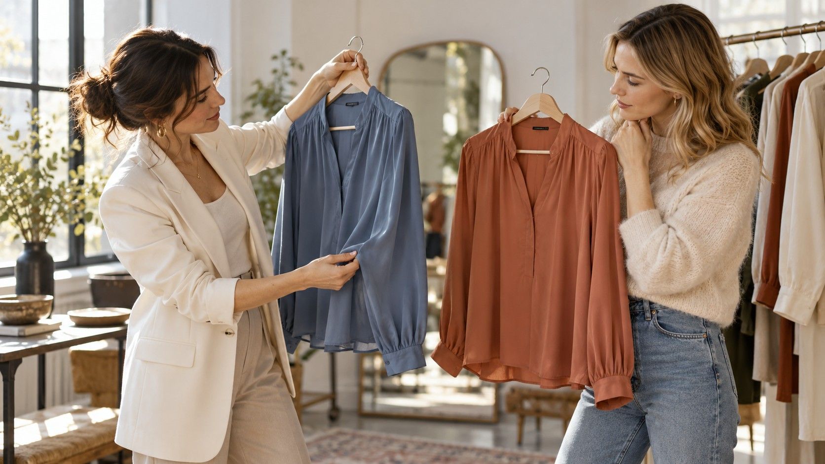
At home, hold two existing tops near your face in indirect daylight. Keep the light, background and makeup consistent if you want a fair comparison. Look for the overall effect you prefer: whether the colour feels comfortable, whether you notice your face first and whether you enjoy wearing it. This is a personal comparison, not a diagnostic test with a correct numerical result.
Try a dark neutral beside a clearer accent, then reduce the accent to a smaller area. For example, compare a dark navy knit with a cool red scarf against the knit on its own. Red is merely a possible test colour; no shade is guaranteed by a body label. If the scarf feels busy, a smaller earring, bag or shoe detail may provide enough contrast.
Photographs can serve as memory aids, provided you keep camera position and exposure similar. Automatic white balance may make one frame cooler than the next, so do not treat a side-by-side phone image as precise colour measurement. If you cannot see a meaningful difference, there is no need to replace a functioning wardrobe over a subtle palette distinction.
Use relaxed fabric while keeping useful structure
To explore the Soft Natural direction, compare fabric that moves with you against fabric that holds its own shape. A fluid shirt, softly structured jacket or supple knit provides an accessible starting point. Relaxed does not need to mean oversized. Check whether the shoulder, armhole and neckline stay in place after you reach forward and sit down.
Dark colours can conceal construction details on a small screen. In person, inspect how a black shirt falls below the bust and where a trouser seam pulls. Try the garment in brighter light and move through several normal positions. A fold caused by insufficient room should not be dismissed as artistic drape; it may disappear in another size or a different pattern cut.
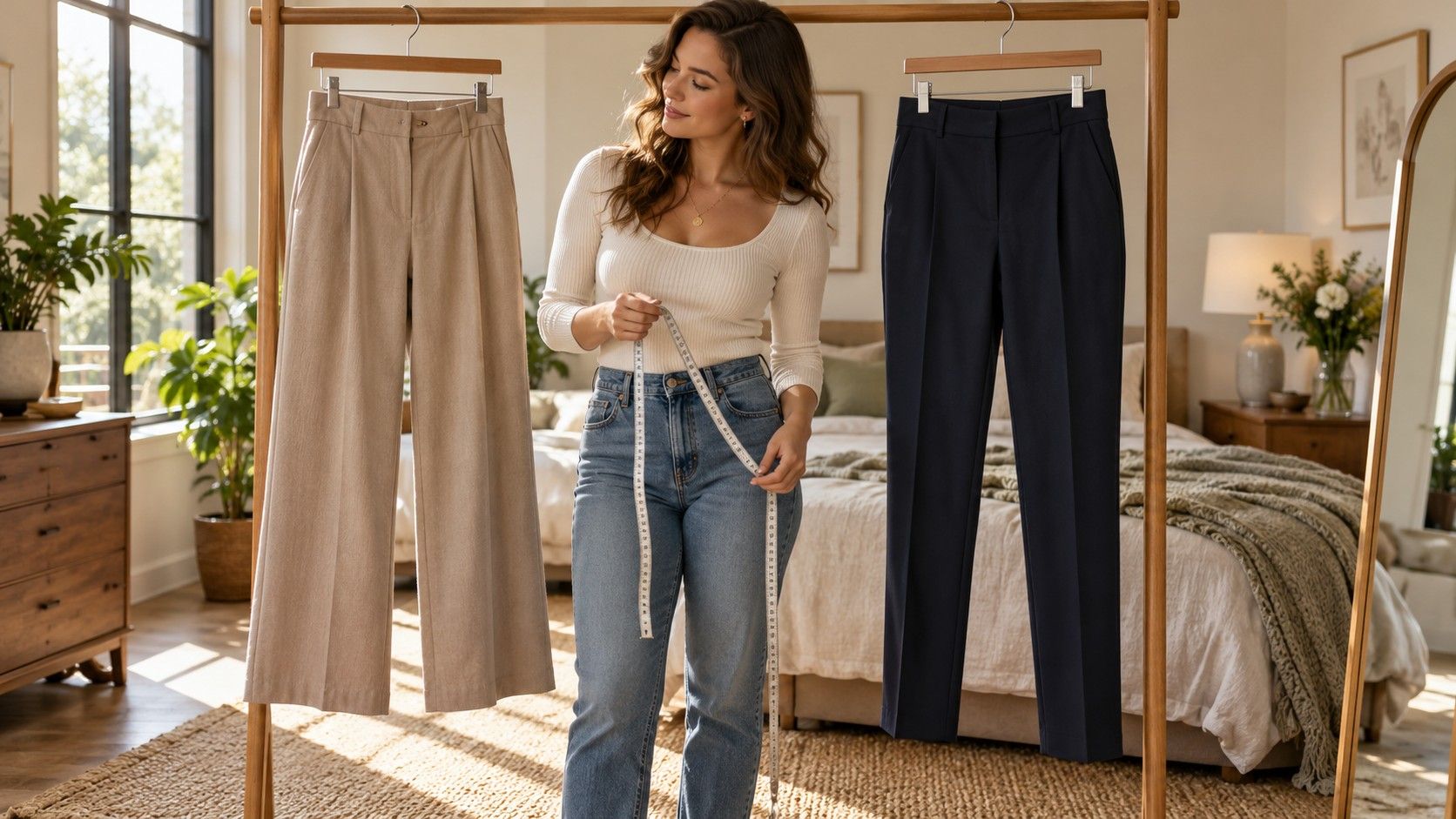
One useful comparison pairs an easy dark blouse with straight trousers, then with wider trousers. Keep the shoes unchanged. The first combination may feel tidy for work; the second may feel more fluid or more cumbersome, depending on fabric and length. If both pieces are loose, a partial tuck or a change of sleeve length can alter the balance without tightening the entire outfit.
A crisp garment is still available to you. If you love a sharp jacket, try it over a softer top and leave it open, then try it fastened. Judge the result as a complete outfit. There is no need to remove all tailoring or add ruffles to compensate for a label. The aim is a repeatable combination with enough comfort for the day.
Put together a daytime outfit and an evening variation
For daytime, try dark denim or washable trousers with an easy knit in a colour you already like. Add shoes suitable for your actual walking distance. A lighter bag or visible shirt collar can introduce contrast without a bright block across the middle of the outfit. Check the seated view, particularly if the top has a loose neckline or the trousers have a stiff high waistband.
For a work version, exchange the denim for trousers that sit cleanly under the top and add a jacket that does not trap the sleeves. A dark tonal outfit can look composed even when its fabrics are soft. Use a simple bag and check for lint on dark knitwear before assuming the overall effect needs more accessories. Surface condition often makes more difference than an elaborate colour formula.
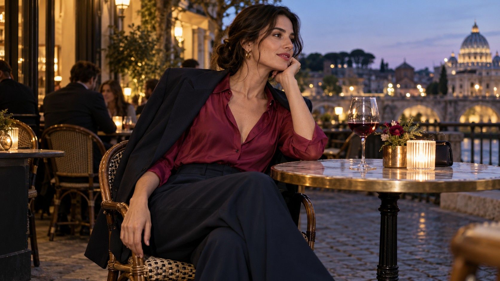
An evening variation could use a fluid dark dress, secure shoes and a single contrasting accessory near the face. Try the dress with your intended underwear and sit down for several minutes. Thin fabric may cling or shift after movement, while a heavier fabric may hang more steadily. These practical differences matter more than whether a product description calls the dress appropriate for an image identity.
If you want a brighter evening outfit, reverse the emphasis: wear the coloured top or dress with quiet dark accessories. Compare that version with a dark base and coloured accessory. You may prefer one large colour area to several small accents. There is no requirement to wear maximum contrast at every neckline, waist and ankle simply because a palette is called Winter.
Adjust contrast one piece at a time
Contrast comes from more than colour. A shiny bag against a matte dress, a narrow belt against a loose shirt and a small print against plain trousers each introduces a different visual interruption. If an outfit feels crowded, remove one of those changes before buying a softer colour. You might like the palette and dislike only the number of competing details.
Try three versions of a favourite dark outfit: no contrasting accessory, one light or bright detail near the face, and the same detail moved to the bag or shoes. Wear each long enough to stop consciously posing. A necklace that looks balanced while still may catch on the fabric all day; a scarf may be unsuitable for the indoor temperature. Personal preference includes those sensations.
For shopping, carry a photograph of a complete successful outfit and note its actual colours in words. A phone image may distort the shade, but it can remind you that your trousers need a top with room through the back or a jacket with a shorter hem. Buy to solve that specific gap. A beautiful berry blouse that needs new trousers, shoes and underwear is a larger decision than its price tag suggests.
Keep one short record of what worked: comfortable shoulder movement, a neckline you enjoyed, a colour pairing you repeated and shoes that suited the hem. Soft Natural and Deep Winter can remain useful shorthand for those preferences. They do not need to become a wardrobe exam, and a favourite piece outside the suggested combination has earned its place through wear.